Side Projects
Cassette Futurism New Tab Page: A Retro Browser Extension With a Starfield and Amber Clock
Part 5 of the thread Desktop tinkering
- What it is
- Browser extension
- My role
- Creator
- Built with
- JavaScript
- React
- Tailwind CSS
- Manifest V3
- Open-Meteo
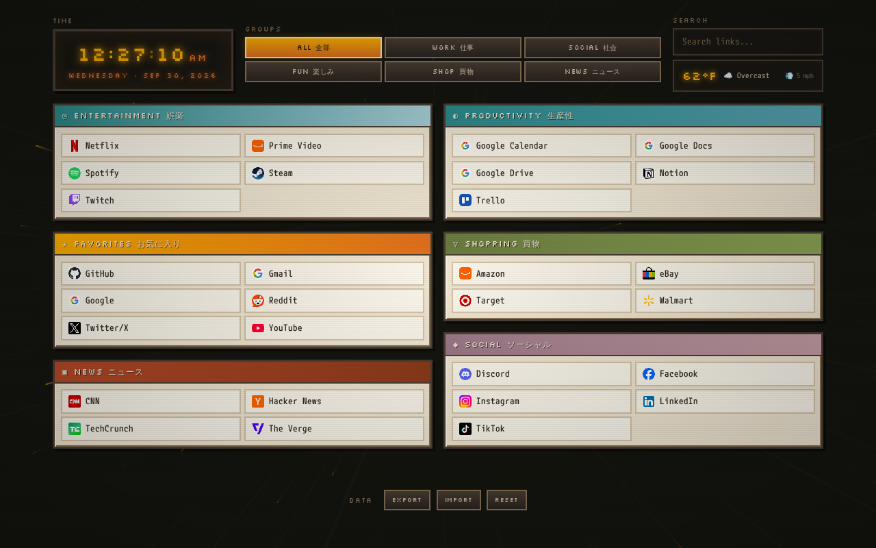
- A new tab page that looks like a '70s sci-fi control panel: amber phosphor clock, beige panels, a warp-speed starfield behind it all.
- Links live in color-coded windows with six group tabs and live search across names and URLs.
- Your links save locally, and Export/Import as JSON is how you back them up or edit them in bulk.
- It's a Manifest V3 extension, so everything it runs has to ship inside the folder. That turned out to matter.
I already built one new tab page, the Custom Homepage with Unsplash photos and real site thumbnails. That one is about pictures. This one is about a mood: cassette futurism, the chunky beige-and-amber look of '70s and '80s sci-fi, where every computer has a phosphor glow and nothing is flat.
It's a small Edge/Chrome extension that replaces the new tab page. You can grab it at the bottom of this post.
The problem
I wanted a new tab page that did three things fast: show me the time and weather, get me to a link in a keystroke or two, and look like somewhere I'd want to land a few hundred times a day. Stock new tab pages are fine at the first two and bland at the third. The earlier homepage leaned on photography. This time I wanted the page itself to be the thing worth looking at.
How it looks
The palette is the whole design. It's defined as CSS variables up front: near-black and dark brown for the background, tan and cream for the panels, then amber, orange, rust, olive, teal, mustard and mauve for accents. Each link group gets its own accent color on its title bar, so after a day you stop reading headings and just go to the teal one.
A few details do most of the work:
- The clock is big amber digits with a blinking colon, plus the day and date underneath.
- The windows are panels with a colored title bar and a small icon glyph, like dialog boxes from a computer that never existed.
- Scanlines and a vignette sit over the whole page as two fixed pseudo-elements with
pointer-events: none, so they're purely cosmetic and never get in the way of a click. - The starfield is a canvas behind everything. Stars stream out from the center at warp speed, drawn as streaks in warm amber hues instead of cold white.
- Two fonts. Silkscreen, a pixel font, for headings and buttons, and M PLUS 1 Code for everything you actually read.
- Japanese subtitles on every section and tab, like FAVORITES お気に入り or NEWS ニュース. Pure set dressing, and I like it.
How it works
The app is React, and the layout uses a handful of Tailwind utility classes on top of hand-written CSS for the retro pieces.
Link groups. Links live in sections: Favorites, Productivity, Social, Entertainment, Shopping and News in the starter set. Six tabs across the top (ALL, WORK, SOCIAL, FUN, SHOP, NEWS) each map to one or more sections, so FUN shows Entertainment and Favorites together.
Live search. Typing filters every visible section by link name or URL as you type, and empty sections drop out.
Favicons. Each link pulls its icon from Google's favicon service. A small domain map points subdomains like dev.azure.com or dash.cloudflare.com at the parent site so they get a real icon instead of a blank.
Weather. It asks the browser for your location and pulls current temperature, conditions and wind from Open-Meteo, which needs no API key. Decline the location prompt and it falls back to New York City. It refreshes every 15 minutes.
Your links, your data. Edits save to localStorage. The footer has EXPORT, IMPORT and RESET. Export downloads your sections as a dated JSON file, and the easiest way to add a pile of links is to export, edit the JSON, and import it back:
{
  "sectionKey": {
    "title": "SECTION NAME 日本語",
    "icon": "★",
    "accent": "accent-amber",
    "links": [
      { "name": "Link Name", "url": "https://example.com/" }
    ]
  }
}
My own copy grew to more than 260 links, grouped around my own life. The version you download ships with a small generic starter set on purpose, since my bookmarks aren't much use to you.
The Manifest V3 catch
The original page pulled React, ReactDOM, Babel and Tailwind from CDNs and compiled the JSX in the browser. Opened as a plain file, that works fine. Loaded as an extension, it renders nothing. Manifest V3 extension pages only run scripts that ship inside the extension, so remote scripts and inline <script> blocks are all blocked.
For the download, the app is precompiled to plain JavaScript, React and ReactDOM are bundled in a vendor/ folder, and the Tailwind classes the page actually uses are baked into a small local stylesheet. It still works if you open newtab.html directly. The Google Fonts stylesheet and the weather call are the only things that still reach the network.
Heads up
If you build your own extension page, test it loaded as an extension, not just as a file. The file version will happily lie to you.
Installing it
- Unzip it somewhere it can stay. The browser loads it from that folder.
- Go to
edge://extensions(orchrome://extensions) and turn on Developer mode. - Click Load unpacked and pick the
cassette-futurism-homepagefolder. - Open a new tab.
The only permission it asks for is storage.
What's next
The obvious gap is editing links on the page itself instead of round-tripping through JSON. The tab groups are also wired to the starter section names in code, so if you rename your sections in the JSON, the group tabs won't follow them yet.
Download the Cassette Futurism homepage and make it yours.